Free
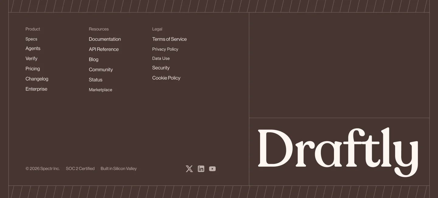
# draftly-footer-01 > Premium footer with three-column navigation, large serif brand wordmark, social links, and diagonal-stripe accent bands in a warm brown palette. ## Overview A full-width footer featuring a two-column layout (at 64rem+ breakpoint): left side contains three vertical navigation groups (Product, Resources, Legal) stacked in a responsive grid, with a bottom row for copyright/certification and social icons; right side displays a large serif wordmark. Diagonal-stripe accent bands frame the top and bottom edges, with subtle vertical hairlines at the sides. Background is warm brown with light cream text and muted accent elements. ## Color | Token | Hex | Usage | |——-|—–|——-| | Background | #473531 | Footer container background | | Primary text | #fff6f1 | Navigation links, brand wordmark | | Muted text | rgba(255,246,241,0.65) | Nav headings, copyright lines, social icons | | Accent border | rgba(255,246,241,0.3) | Diagonal stripes, vertical/horizontal hairlines | ## Typography | Element | Font | Weight | Size | Line height | Letter spacing | |———|——|——–|——|————-|—————–| | Nav heading | Neue Haas Grotesk Display Pro / Inter / system-ui | 400 | 14px | 24px | 0.08px | | Nav link | Neue Haas Grotesk Display Pro / Inter / system-ui | 400 | 16px | 24px | 0.08px | | Copyright/cert line | Neue Haas Grotesk Display Pro / Inter / system-ui | 400 | 14px | 24px | 0.08px | | Brand wordmark | Recoleta / Newsreader / Cirka / Georgia | 400 | 80px (mobile), 120px (40rem+), 171px (64rem+) | 1 | -1.6px (mobile), -2.4px (40rem+), -3.4227px (64rem+) | ## Spacing & layout | Property | Value | |———-|——-| | Container max-width | 1400px | | Container padding | 24px (mobile), 40px (40rem+), 84px (64rem+) | | Container vertical padding | 64px (mobile), 80px (40rem+), 84px (64rem+) | | Nav column gap (horizontal) | 24px (2-col mobile), 24px (3-col 40rem+) | | Nav column gap (vertical) | 40px | | Left/right main gap | 92px (64rem+) | | Bottom row gap | 24px (mobile), space-between (40rem+) | | Diagonal stripe height | 40px (top and bottom) | | Diagonal stripe offset | 28px (left/right) | | Vertical hairline width | 1px | | Social icon spacing | 16px | | Social icon size | 24px container, 18px icon (X/LinkedIn), 20px icon (YouTube) | | Nav item vertical spacing | 4px top, 5px bottom padding | | Nav heading bottom padding | 4px | ## Anatomy – **Footer wrapper** – Background: #473531 – Position: relative, overflow hidden – Top diagonal-stripe band (hidden mobile, visible 64rem+) – Height: 40px – Style: repeating linear gradient at 115deg with rgba(255,246,241,0.32) – Border: top and bottom rgba(255,246,241,0.3) – Bottom diagonal-stripe band (hidden mobile, visible 64rem+) – Height: 40px – Same stripe pattern as top – Border: top rgba(255,246,241,0.3) – Left vertical hairline (hidden mobile, visible 64rem+) – Position: 28px from left – Full height – Color: rgba(255,246,241,0.3) – Right vertical hairline (hidden mobile, visible 64rem+) – Position: 28px from right – Full height – Color: rgba(255,246,241,0.3) – **Main container** – Max-width: 1400px – Layout: flex column (mobile/40rem), flex row (64rem+) – Gap: 48px (mobile/40rem), 92px (64rem+) – **Left section** (flex-1, flex column) – Height: 482px (64rem+) – Gap: 48px – **Navigation grid** – Layout: 2 columns (mobile), 3 columns (40rem+) – Column gap: 24px – Row gap: 40px – **Nav column** (repeated 3×) – **Heading** – Font: SANS, 14px, 400 – Line height: 24px – Letter spacing: 0.08px – Color: rgba(255,246,241,0.65) – Padding bottom: 4px – **Link list** – Layout: flex column – **Link item** – Font: SANS, 16px, 400 – Line height: 24px – Letter spacing: 0.08px – Color: #fff6f1 – Padding: 4px top, 5px bottom – Hover: opacity 80% – **Bottom row** – Layout: flex column (mobile), flex row space-between (40rem+) – Gap: 24px – **Copyright list** – Layout: flex row, wrap – Gap: 20px (horizontal), 8px (vertical) – Font: SANS, 14px, 400 – Line height: 24px – Letter spacing: 0.08px – Color: rgba(255,246,241,0.65) – Whitespace: nowrap per item – **Social icon list** – Layout: flex row – Gap: 16px – **Social link** (3×: X, LinkedIn, YouTube) – Size: 24px – Icon size: 18px (X/LinkedIn), 20px (YouTube) – Color: rgba(255,246,241,0.65) – Opacity: 90% default, 100% hover – Fill: currentColor – **Right section** (wordmark container, 64rem+) – Width: 600px – Shrink: 0 – Layout: flex, items-end, justify-start (mobile), justify-end (64rem+) – **Brand wordmark** – Font: SERIF, 400 – Size: 80px (mobile), 120px (40rem+), 171px (64rem+) – Line height: 1 (solid) – Letter spacing: -1.6px (mobile), -2.4px (40rem+), -3.4227px (64rem+) – Color: #fff6f1 – Default brand text: “Draftly” ## Interactions / states – **Nav links**: Opacity transitions to 80% on hover – **Social icons**: Opacity transitions from 90% to 100% on hover; base color rgba(255,246,241,0.65) – **Responsive breakpoints**: – Mobile: 2-column nav grid, vertical bottom row, 80px wordmark – 40rem+ (tablet): 3-column nav grid, horizontal space-between bottom row, 120px wordmark – 64rem+ (desktop): 2-column flex layout (left/right), diagonal stripes and hairlines visible, 171px wordmark, 482px left section height – **Reduced motion**: not specified – **Focus states**: not specified
You may also like

We break down what makes top websites convert, then turn it into ready-to-use AI prompts for your own designs.

okay now you know who we are

Come build with us.

Try Web2Prompt free. Follow along on what we’re building. If you have a problem we should solve or a format we should add — reach out. We actually read every single email. Not a bot. Not a template. Us.