



# draftly-cta-01
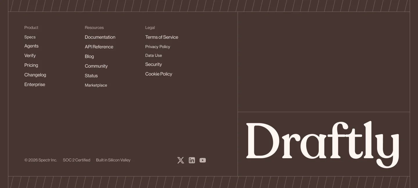
> Full-bleed CTA section with atmospheric background image and a cream call-to-action card containing serif headline, body copy, and primary button, with vertical hairline grid overlay.
## Overview
Full-bleed section with a background image covering the entire viewport. A cream-colored card positioned right-aligned (on desktop) or center-aligned (on mobile) contains a serif headline, sans-serif body copy, and a dark button. Four vertical hairlines (at 28px from left edge, center, 28px from right edge, and ~91.67% across) create a subtle grid overlay at breakpoint 64rem and above.
## Color
| Token | Hex | Usage |
|——-|—–|——-|
| Card background | #fff6f1 | CTA card fill |
| Card text | #473531 | Heading, body copy color |
| Button background | #473531 | CTA button fill |
| Button text | #fff6f1 | CTA button label color |
| Hairline overlay | rgba(255,246,241,0.3) | Vertical grid lines |
## Typography
| Element | Font | Weight | Size | Line height | Letter spacing |
|———|——|——–|——|————-|—————–|
| Heading | Recoleta, Newsreader, Cirka, Georgia, serif | not specified | 28px (mobile), 36px (@40rem), 40px (@64rem) | 1.1 | –0.56px (mobile), –0.72px (@40rem), –0.8px (@64rem) |
| Body copy | Neue Haas Grotesk Display Pro, Inter, system-ui, sans-serif | not specified | 16px | 1.6 | 0.16px |
| Button label | Neue Haas Grotesk Display Pro, Inter, system-ui, sans-serif | not specified | 14px | 1.6 | not specified |
## Spacing & layout
| Property | Value |
|———-|——-|
| Container width | Full width, overflow hidden |
| Section padding | 16px horizontal, 16px vertical (mobile); 40px horizontal, 20px vertical (@40rem); 84px all sides (@64rem) |
| Card max-width | 639px |
| Card padding | 28px (@mobile), 34px (@40rem) |
| Card gap (heading to body to button) | 18px |
| Button padding | 24px horizontal, 8px vertical |
| Button border-radius | 8px |
| Hairline positions | Left: 28px, Center: 50%, Right: 28px from right, Far right: 91.67% + 36px – 28px (desktop only) |
## Anatomy
– **Section container**
– Full-bleed, position relative, isolate z-index
– Background image layer (absolute, inset 0, z-index –10)
– `![]() ` with object-cover, full size
– Vertical hairline overlays (4 lines, hidden below @64rem)
– Left edge hairline: 28px from left, 1px wide, rgba(255,246,241,0.3)
– Right edge hairline: 28px from right, 1px wide, rgba(255,246,241,0.3)
– Center hairline: 50% left offset, 1px wide, rgba(255,246,241,0.3)
– Far-right hairline: 91.67% + offset, 1px wide, rgba(255,246,241,0.3)
– Content wrapper (relative, flex, center-aligned mobile; right-aligned @64rem)
– **CTA card**
– Background: #fff6f1
– Padding: 28px (mobile), 34px (@40rem)
– Gap: 18px (flex column, items-start)
– Overflow: hidden
– **Heading**
– Font family: Recoleta serif
– Size: 28px (mobile), 36px (@40rem), 40px (@64rem)
– Line height: 1.1
– Tracking: –0.56px (mobile), –0.72px (@40rem), –0.8px (@64rem)
– Color: #473531
– **Body paragraph**
– Font family: Neue Haas Grotesk Display Pro sans
– Size: 16px
– Line height: 1.6
– Tracking: 0.16px
– Color: #473531
– **CTA button (link element)**
– Background: #473531
– Text color: #fff6f1
– Font family: Neue Haas Grotesk Display Pro sans
– Size: 14px
– Line height: 1.6
– Padding: 24px horizontal, 8px vertical
– Border-radius: 8px
– Display: inline-flex, centered, overflow hidden
– Transition: opacity on hover
## Interactions / states
– **Button hover**: opacity changes to 0.9 (transition applied)
– **Responsive breakpoints**:
– Mobile (default): centered card, smaller padding and text, hairlines hidden
– @40rem: increased padding and heading size
– @64rem: card right-aligned, largest text sizes, hairlines visible
– **Background image**: object-cover ensures full coverage
– **Hairlines**: pointer-events-none, aria-hidden (decorative)
` with object-cover, full size
– Vertical hairline overlays (4 lines, hidden below @64rem)
– Left edge hairline: 28px from left, 1px wide, rgba(255,246,241,0.3)
– Right edge hairline: 28px from right, 1px wide, rgba(255,246,241,0.3)
– Center hairline: 50% left offset, 1px wide, rgba(255,246,241,0.3)
– Far-right hairline: 91.67% + offset, 1px wide, rgba(255,246,241,0.3)
– Content wrapper (relative, flex, center-aligned mobile; right-aligned @64rem)
– **CTA card**
– Background: #fff6f1
– Padding: 28px (mobile), 34px (@40rem)
– Gap: 18px (flex column, items-start)
– Overflow: hidden
– **Heading**
– Font family: Recoleta serif
– Size: 28px (mobile), 36px (@40rem), 40px (@64rem)
– Line height: 1.1
– Tracking: –0.56px (mobile), –0.72px (@40rem), –0.8px (@64rem)
– Color: #473531
– **Body paragraph**
– Font family: Neue Haas Grotesk Display Pro sans
– Size: 16px
– Line height: 1.6
– Tracking: 0.16px
– Color: #473531
– **CTA button (link element)**
– Background: #473531
– Text color: #fff6f1
– Font family: Neue Haas Grotesk Display Pro sans
– Size: 14px
– Line height: 1.6
– Padding: 24px horizontal, 8px vertical
– Border-radius: 8px
– Display: inline-flex, centered, overflow hidden
– Transition: opacity on hover
## Interactions / states
– **Button hover**: opacity changes to 0.9 (transition applied)
– **Responsive breakpoints**:
– Mobile (default): centered card, smaller padding and text, hairlines hidden
– @40rem: increased padding and heading size
– @64rem: card right-aligned, largest text sizes, hairlines visible
– **Background image**: object-cover ensures full coverage
– **Hairlines**: pointer-events-none, aria-hidden (decorative)

# draftly-cta-01
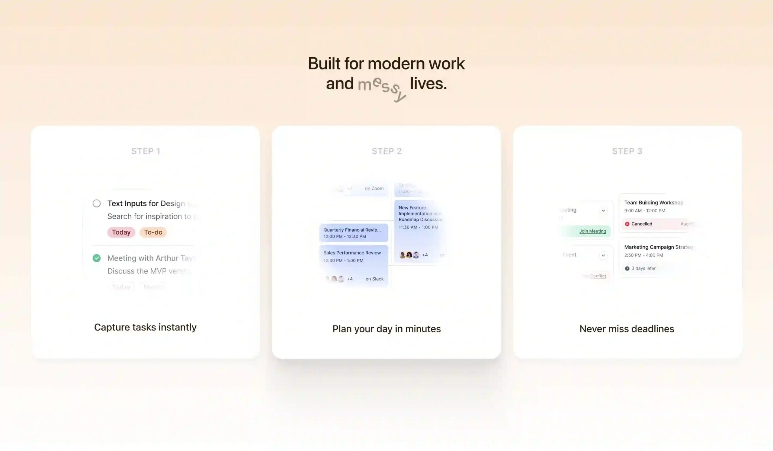
> Full-bleed CTA section with atmospheric background image and a cream call-to-action card containing serif headline, body copy, and primary button, with vertical hairline grid overlay.
## Overview
Full-bleed section with a background image covering the entire viewport. A cream-colored card positioned right-aligned (on desktop) or center-aligned (on mobile) contains a serif headline, sans-serif body copy, and a dark button. Four vertical hairlines (at 28px from left edge, center, 28px from right edge, and ~91.67% across) create a subtle grid overlay at breakpoint 64rem and above.
## Color
| Token | Hex | Usage |
|——-|—–|——-|
| Card background | #fff6f1 | CTA card fill |
| Card text | #473531 | Heading, body copy color |
| Button background | #473531 | CTA button fill |
| Button text | #fff6f1 | CTA button label color |
| Hairline overlay | rgba(255,246,241,0.3) | Vertical grid lines |
## Typography
| Element | Font | Weight | Size | Line height | Letter spacing |
|———|——|——–|——|————-|—————–|
| Heading | Recoleta, Newsreader, Cirka, Georgia, serif | not specified | 28px (mobile), 36px (@40rem), 40px (@64rem) | 1.1 | –0.56px (mobile), –0.72px (@40rem), –0.8px (@64rem) |
| Body copy | Neue Haas Grotesk Display Pro, Inter, system-ui, sans-serif | not specified | 16px | 1.6 | 0.16px |
| Button label | Neue Haas Grotesk Display Pro, Inter, system-ui, sans-serif | not specified | 14px | 1.6 | not specified |
## Spacing & layout
| Property | Value |
|———-|——-|
| Container width | Full width, overflow hidden |
| Section padding | 16px horizontal, 16px vertical (mobile); 40px horizontal, 20px vertical (@40rem); 84px all sides (@64rem) |
| Card max-width | 639px |
| Card padding | 28px (@mobile), 34px (@40rem) |
| Card gap (heading to body to button) | 18px |
| Button padding | 24px horizontal, 8px vertical |
| Button border-radius | 8px |
| Hairline positions | Left: 28px, Center: 50%, Right: 28px from right, Far right: 91.67% + 36px – 28px (desktop only) |
## Anatomy
– **Section container**
– Full-bleed, position relative, isolate z-index
– Background image layer (absolute, inset 0, z-index –10)
– `![]() ` with object-cover, full size
– Vertical hairline overlays (4 lines, hidden below @64rem)
– Left edge hairline: 28px from left, 1px wide, rgba(255,246,241,0.3)
– Right edge hairline: 28px from right, 1px wide, rgba(255,246,241,0.3)
– Center hairline: 50% left offset, 1px wide, rgba(255,246,241,0.3)
– Far-right hairline: 91.67% + offset, 1px wide, rgba(255,246,241,0.3)
– Content wrapper (relative, flex, center-aligned mobile; right-aligned @64rem)
– **CTA card**
– Background: #fff6f1
– Padding: 28px (mobile), 34px (@40rem)
– Gap: 18px (flex column, items-start)
– Overflow: hidden
– **Heading**
– Font family: Recoleta serif
– Size: 28px (mobile), 36px (@40rem), 40px (@64rem)
– Line height: 1.1
– Tracking: –0.56px (mobile), –0.72px (@40rem), –0.8px (@64rem)
– Color: #473531
– **Body paragraph**
– Font family: Neue Haas Grotesk Display Pro sans
– Size: 16px
– Line height: 1.6
– Tracking: 0.16px
– Color: #473531
– **CTA button (link element)**
– Background: #473531
– Text color: #fff6f1
– Font family: Neue Haas Grotesk Display Pro sans
– Size: 14px
– Line height: 1.6
– Padding: 24px horizontal, 8px vertical
– Border-radius: 8px
– Display: inline-flex, centered, overflow hidden
– Transition: opacity on hover
## Interactions / states
– **Button hover**: opacity changes to 0.9 (transition applied)
– **Responsive breakpoints**:
– Mobile (default): centered card, smaller padding and text, hairlines hidden
– @40rem: increased padding and heading size
– @64rem: card right-aligned, largest text sizes, hairlines visible
– **Background image**: object-cover ensures full coverage
– **Hairlines**: pointer-events-none, aria-hidden (decorative)
` with object-cover, full size
– Vertical hairline overlays (4 lines, hidden below @64rem)
– Left edge hairline: 28px from left, 1px wide, rgba(255,246,241,0.3)
– Right edge hairline: 28px from right, 1px wide, rgba(255,246,241,0.3)
– Center hairline: 50% left offset, 1px wide, rgba(255,246,241,0.3)
– Far-right hairline: 91.67% + offset, 1px wide, rgba(255,246,241,0.3)
– Content wrapper (relative, flex, center-aligned mobile; right-aligned @64rem)
– **CTA card**
– Background: #fff6f1
– Padding: 28px (mobile), 34px (@40rem)
– Gap: 18px (flex column, items-start)
– Overflow: hidden
– **Heading**
– Font family: Recoleta serif
– Size: 28px (mobile), 36px (@40rem), 40px (@64rem)
– Line height: 1.1
– Tracking: –0.56px (mobile), –0.72px (@40rem), –0.8px (@64rem)
– Color: #473531
– **Body paragraph**
– Font family: Neue Haas Grotesk Display Pro sans
– Size: 16px
– Line height: 1.6
– Tracking: 0.16px
– Color: #473531
– **CTA button (link element)**
– Background: #473531
– Text color: #fff6f1
– Font family: Neue Haas Grotesk Display Pro sans
– Size: 14px
– Line height: 1.6
– Padding: 24px horizontal, 8px vertical
– Border-radius: 8px
– Display: inline-flex, centered, overflow hidden
– Transition: opacity on hover
## Interactions / states
– **Button hover**: opacity changes to 0.9 (transition applied)
– **Responsive breakpoints**:
– Mobile (default): centered card, smaller padding and text, hairlines hidden
– @40rem: increased padding and heading size
– @64rem: card right-aligned, largest text sizes, hairlines visible
– **Background image**: object-cover ensures full coverage
– **Hairlines**: pointer-events-none, aria-hidden (decorative)